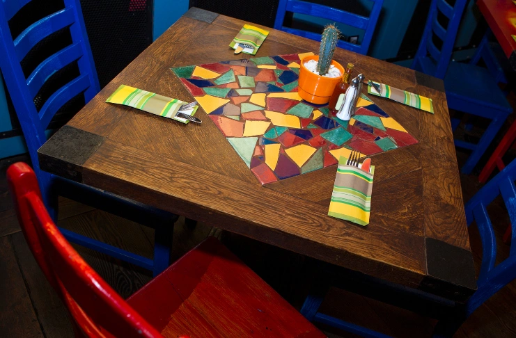
Your restaurant’s color scheme does more than set the tone. It affects how long guests stay, what they order, and whether they come back. Color choices influence appetite, mood, and even spending behavior.
Research shows that 90% of first impressions are driven by color. Restaurant owners who understand color psychology gain a clear edge over those who choose palettes based on personal preference.
This guide breaks down how to strengthen your restaurant branding with colors, what different hues signal to diners, where to apply them effectively, and how to avoid costly design missteps.
Why Does Restaurant Color Psychology Matter?
Color psychology shapes every aspect of your dining experience. When customers walk into your restaurant, their brains process colors before they even read your menu.
The right restaurant color can:
- Increase appetite by 15-20%
- Speed up table turnover during busy hours
- Create romantic settings for date nights
- Make small spaces feel larger
- Build brand recognition that lasts
Fast-food restaurants utilize this science daily. Notice how McDonald’s combines red and yellow? That’s not a coincidence.
How Do Different Colors Affect Customer Behavior?

Each color triggers specific responses in your customers’ minds. Understanding these reactions helps you create the exact atmosphere you want.
Red: The appetite stimulant. Red increases heart rate and makes people hungry. Perfect for fast food and casual dining, where you want quick decisions.
Blue: The calming color. Blue suppresses appetite but creates relaxation. Great for fine dining, where you want customers to linger and spend more.
Green: The health signal. Green connects to natural foods and wellness. Ideal for restaurants focusing on organic ingredients.
Yellow: The happiness booster. Yellow creates cheerful energy but can become overwhelming. Use it as an accent, not the main color.
Orange: The social color. Orange encourages conversation and creates warmth. Perfect for family restaurants and coffee shops.
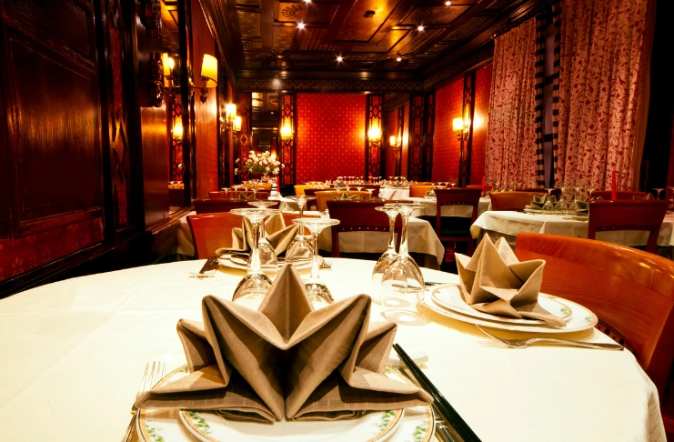
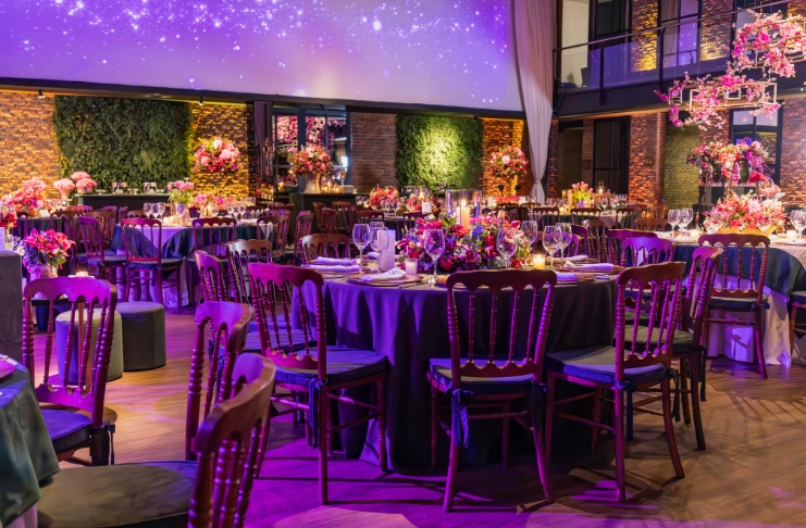
Purple: The luxury indicator. Purple signals premium quality and sophistication. Use it sparingly in upscale establishments.
INDUSTRY INSIGHT
| Research from the University of Winnipeg reveals that customers make dining decisions within 90 seconds of entering a restaurant. During this crucial window, color influences between 62% and 90% of their purchasing decisions. This means your color palette directly impacts your bottom line from the moment guests walk through your door. |
Which Restaurant Color Schemes Actually Work for Branding?
Different color combinations create distinct atmospheres. Choose based on your restaurant’s concept and target customers.
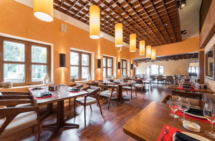
Warm Colors (Red, Orange, Yellow):
- Increase table turnover
- Stimulate appetite
- Create energetic environments
- Perfect for fast-casual eateries
Cool Colors (Blue, Green, Purple):
- Promote relaxation
- Encourage longer stays
- Reduce appetite slightly
- Ideal for fine dining
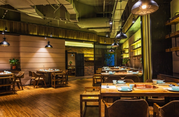
Earthy Colors (Brown, Beige, Olive Green):
- Connect to natural ingredients
- Create welcoming atmospheres
- Appeal to health-conscious customers
- Works well for organic restaurants
Neutral Colors (Light Gray, Pale Yellow, Cream):
- Make spaces appear larger
- Create timeless elegance
- Blend with any decor style
- Suitable for most restaurant types
How Can You Use Red to Boost Sales?
Red is the most powerful color for increasing appetite and encouraging quick decisions. But use it strategically.
Try adding red to accent walls behind the bar or use it for menu highlights on popular items. Call-to-action buttons on ordering systems work well in red, too. Even small touches, such as red napkins or candles, can make a significant difference.
Red pairs beautifully with cream for classic elegance, dark brown for rustic charm, or light gray for modern appeal.
Avoid covering entire walls in bright red. It can make customers feel rushed and uncomfortable after 20 minutes.
When Should You Choose Blue for Your Restaurant?
Blue works best when you want customers to relax and stay longer. It’s ideal for establishments where higher check averages are more important than quick turnover.
Blue works best for seafood restaurants where there’s a natural connection to water. Wine bars and lounges benefit from blue’s calming effect, while upscale dining establishments use it to encourage longer stays. Breakfast spots often choose blue to create calm morning vibes.
Navy blue with white creates a nautical theme, while light blue with gray offers a contemporary look. Blue paired with warm wood tones provides perfect balance.
Remember: blue is an appetite suppressant, so pair it with warmer accent colors to encourage food orders.
How Does Green Impact Your Restaurant’s Success?
Green has become increasingly popular as more diners seek healthy options. It signals freshness, natural ingredients, and environmental consciousness.
Color green works perfectly for salad bars and juice shops where freshness is key. Farm-to-table restaurants benefit from the natural associations with green, while vegetarian establishments use it to reinforce their plant-based focus. Coffee shops emphasizing organic beans often choose green for this reason.
Use sage green for sophisticated looks, bright green for energy and freshness, or olive green for earthy, natural feels.
Pair color green with natural materials like wood and stone to reinforce the organic message.
What Role Does Yellow Play in Restaurant Design?
Yellow creates instant happiness and energy. It’s perfect for breakfast spots and family restaurants where you want cheerful atmospheres.
Yellow works great for accent walls in dining areas and exterior signage for maximum visibility. Kitchen-visible elements in yellow create warmth, while children’s seating areas benefit from their cheerful energy.
However, too much yellow can cause eye strain and make food look unappetizing under certain lighting conditions. It might feel overwhelming in small spaces, too.
Use yellow strategically as an accent rather than the dominant color.
How Do Orange and Purple Affect Dining Experiences?
Orange encourages social interaction and creates warmth. It’s ideal for restaurants where conversation and community matter.
Orange benefits:
- Promotes appetite
- Encourages longer group dining
- Creates cozy atmospheres
- Appeals to families
Purple signals luxury and sophistication. Use it sparingly in upscale restaurants to create premium perceptions.
Purple applications:
- Accent lighting
- Upholstery details
- Wine storage displays
- VIP seating areas
Which Colors Should You Avoid?
Some colors create negative associations, or worse, disrupt the dining experience.
Bright neons are overstimulating. They don’t invite lingering, and they clash with most plating styles. In a UK survey, nearly 15% of men named Neon Fuchsia as their least favorite color, reinforcing how harsh brights can backfire in mixed-audience settings.
Pink often makes raw or rare meat look unappealing. In the U.S., 27% of people in a national survey ranked pink as the least attractive color. It doesn’t pair well with the warm, earthy tones of most savory food.
Baby Puke Green, a muted, yellowish-green tone, is another turnoff. Over 20% of the surveyed Millennials reported disliking it. In short, trying to be “unique” with offbeat greens may alienate younger diners.
Pure black walls can feel cold and unwelcoming, especially in low-light spaces. Overly dark interiors visually shrink a room and make food appear less vibrant.
And colors like muddy brown or overused purple can subconsciously signal dirtiness or reduce appetite when not paired with neutral accents.
How Can You Test Your Color Choices?
Before committing to a full restaurant color scheme, test your choices with real customers.
Paint small sections and observe customer reactions before committing to full walls. Use removable wall coverings for trial periods, survey regular customers about color preferences, and monitor sales data during test periods.
Observe how long customers spend in different colored areas and whether certain colors lead to increased sales of specific menu items. Pay attention to customer comfort levels in various lighting conditions and gather staff feedback about working in different colored spaces.
What Are the Common Color Psychology Mistakes?
Many restaurant owners make these costly color mistakes that hurt their business.
Many restaurant owners choose personal favorites instead of strategic colors. Others use too many bright colors together, ignore how colors look under restaurant lighting, copy competitors without considering their own concept, or neglect basic color wheel principles.
To avoid these mistakes, test colors in your actual lighting conditions and consider your target demographic’s preferences. Balance energizing and calming elements to create a cohesive color story throughout your space.
How Should You Implement Your Color Strategy?
Start with one area and gradually expand your color scheme throughout the restaurant.
Implementation steps:
- Choose your primary color based on the concept
- Select 2-3 complementary colors
- Test the palette in high-traffic areas
- Gather customer feedback
- Expand to other elements gradually
Key areas to address:
- Entrance and waiting areas
- Main dining spaces
- Bar and beverage stations
- Restrooms and service areas
- Exterior signage and facades
Your color palette should create a cohesive story that supports your restaurant’s brand and operational goals.
Conclusion
Color isn’t just decor. It’s a powerful tool in restaurant branding that influences perceived intention, customer behavior, and the overall dining experience.
Most restaurants overlook the role of color in interior design, focusing instead on furniture or menu layout. But your restaurant’s interior (walls, lighting, accents, even tableware) plays a direct role in how long customers stay, how much they spend, and how they feel while dining.
Strong stimulants, such as bright yellow or bright shades, can cause sensory overload in small spaces. Conversely, light colors like pale yellow or gray may lack impact if the restaurant’s concept demands boldness. Aim for balance.
Frequently Asked Questions
1. Which color is best for restaurant brands?
Red is most effective for increasing appetite and encouraging quick decisions, making it ideal for fast food and casual dining establishments.
2. What is the best color for food branding?
Warm colors, such as red, orange, and yellow, work best as they stimulate the appetite and create positive associations with food.
3. What do the colors of restaurant logos mean?
Red signals energy and appetite, green represents health and nature, blue conveys trust and calm, while yellow suggests happiness and affordability.
4. What is the rule for branding color palette?
Use 60% primary color, 30% secondary color, and 10% accent color. Ensure that colors align with your brand message and your target audience’s preferences.
5. What colors attract food customers?
Warm colors (red, orange, yellow) attract customers by stimulating the appetite, while green appeals to health-conscious diners seeking natural options.
6. How do you choose the colors you will use in branding?
Consider your restaurant concept, target demographic, desired atmosphere, and the psychological effects it will have. Test colors in your actual space before making a commitment.
7. How to choose a food brand color?
Analyze your menu type, target customers, and desired dining pace. Fast food uses warm colors, while fine dining often employs cooler, sophisticated tones.
8. What is the purpose of color in food design?
Color influences appetite, mood, perceived taste, and dining duration. It creates emotional connections and affects purchasing decisions.
9. What is the impact of color in design?
Color affects 90% of first impressions, influences 62-90% of purchasing decisions, and can increase brand recognition by up to 80%.
10. Why should restaurant owners think about color?
Color psychology has a direct impact on customer behavior, sales, table turnover, and brand recognition. It’s a powerful tool for business success.
11. How do restaurant color schemes affect your customers?
Colors influence how long customers stay, how much they order, their comfort level, and whether they return for future visits.
12. What is the color psychology of the food industry?
The food industry uses warm colors to stimulate appetite, cool colors for premium positioning, and green for health messaging.
13. What is the psychology of color in branding?
Color psychology in branding fosters emotional connections, conveys brand values, influences purchasing decisions, and establishes memorable brand recognition.