Did you know you can increase your restaurant’s foot traffic by 17% and daily sales by up to 30% using food posters?
That’s right. A well-designed restaurant poster can be a strategic tool to influence your customers’ decisions. You can use it to promote signature dishes, announce lunch hours, or highlight seasonal offers. Each poster has the potential to shape the way potential customers see your restaurant.
The challenge is that most posters fail because they overlook design essentials. They end up cluttered, hard to read, or disconnected from the brand.
So how do you ensure your posters are eye-catching and leave a lasting impression? This article will walk you through practical restaurant poster design tips you can apply right away.
Why Does Poster Design Matter for Restaurants?
Posters remain one of the most cost-effective marketing tools in the restaurant business. Unlike digital ads that disappear in seconds, a well-placed restaurant poster continues to work for you every time someone walks past it.
The right design can attract attention, spark hunger, and bring customers straight through your doors.
Think about the role of a poster near your restaurant’s location. It can convey a restaurant’s menu, location, pictures, contact details, and discounts in a way that instantly builds trust.
With vibrant colors, simple fonts, and clear graphic elements, you can convey all the information customers need without overwhelming them.
For most people, dining decisions are often made quickly and visually. A food poster placed at the right sign point can trigger a good appetite and influence them to visit on the spot.
That makes design elements like legible fonts, high-quality images, and consistent brand colors crucial to how your establishment is perceived.
INDUSTRY INSIGHT
| 82% of consumers trust print ads more when making purchasing decisions, and strong visuals significantly boost engagement. High-quality images of food and creative illustrations on a restaurant poster can trigger hunger, attract attention, and influence potential customers to visit immediately. |
Who Are You Designing Restaurant Posters For?

You must know who you want to reach if you want your poster to work. Are you targeting corporate office workers, families, late-night diners, health-conscious eaters, or eventgoers? Each group responds differently to creative illustrations, i.e., colors, visuals, layout, and even messages.
Young adults (Millennials & Gen Z) look for visuals first. They make decisions based on what catches their eye: vivid food photography, typography, bold colors, and relatable graphics.
Older groups may opt for simple fonts, fewer elements, and a clean layout that makes information easy to comprehend.
How can you deliver the exact?
First, map out key traits of your potential customers:
- What makes them hungry?
- Where do they see your posters (street, mall, inside your establishment, social media)?
- What tone works (playful, upscale, casual, fast)?
- What color stops them mid-way (yellow, green, red?)
Graphic designers often skip this step, and it shows. If a poster doesn’t match audience preferences, no amount of color, pictures, or promotions will convert lookers into visitors.
Knowing your audience guides your design decisions: images, messages, layout, and colors. A poster that appeals to your target makes your restaurant’s message more relevant, increases the chance they’ll visit, and reduces wasted effort and cost.
What are the Key Elements of an Effective Restaurant Poster?
A restaurant poster is only as strong as its individual design elements. Each choice, from headline to call-to-action, shapes how potential customers perceive your restaurant.
Focus on these food poster design essentials to create a poster that draws attention, drives visits, and has a bigger impact.
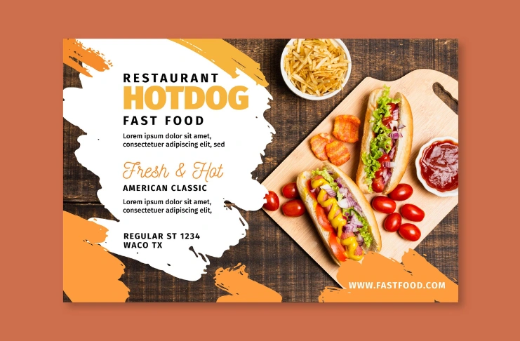
1. Compelling Headlines
Your headline is the first thing viewers notice. Keep it short, clear, and relevant. Highlight signature dishes, promotions, or discounts right away. Use action words like “Try,” “Taste,” or “Discover” to create urgency.
A good headline sets expectations and immediately communicates the value of your restaurant’s menu. Experiment with several fonts and styles, but ensure readability.
2. High-Quality Visuals
Images sell food more than words ever can. Add creative illustrations and visually striking graphics to attract attention. Include images that convey freshness and appeal to the senses. For example, think of bright citrus fruits or perfectly plated dishes.
Avoid generic stock photos, though. Authenticity builds trust. Visuals should complement your message and stand out in a crowded space.
3. Call-to-Action Placement
A call-to-action (CTA) tells viewers exactly what to do next: visit, order online, or call for reservations.
Place it where the eye naturally rests, often toward the bottom or center of the poster. Make it bold, simple, and actionable.
Including contact details or your website ensures potential customers can act immediately.
4. Brand Consistency
Your poster should reflect your restaurant’s personality. Stick to brand colors, consistent typography, and recognizable design elements.
This reinforces your restaurant’s identity and ensures that potential customers can instantly connect the poster to your establishment. Brand consistency builds familiarity and a lasting impression that encourages repeat visits.
What Design Principles Should You Use for Visual Appeal & Maximum Impact?

Strong design principles that ensure your restaurant poster is not only attractive but also effective in converting viewers into customers. Below are the key elements you should consider when brainstorming for your next restaurant poster ideas.
Color Psychology in Restaurant Marketing
Colors influence appetite and emotions. Warm tones like red and yellow stimulate hunger and attract attention, while green signals freshness and healthy choices.
Use vibrant colors selectively to highlight key features of your food poster. Overloading it with too many colors can confuse potential customers and dilute your message.
Typography Choices and Readability
Fonts communicate personality and guide viewers through the poster. Choose legible fonts that are easy to read from a distance.
Simple fonts often work best for body text, while bold or decorative fonts can highlight headlines or promotions.
Avoid using several fonts, as too many can make your poster look chaotic. Consistency in typography builds a cohesive look and strengthens brand recognition.
Layout, Balance, and Hierarchy
Organize your content so the eye naturally flows from the headline to visuals, then to the call-to-action. Use alignment, spacing, and hierarchy to balance elements and prevent clutter.
A well-structured layout ensures that potential customers quickly understand the message and are motivated to act.
How Should Promotions and Offers Be Highlighted?

Promotions and discounts give your restaurant poster an immediate reason for potential customers to visit.
Highlight limited-time offers, seasonal menus, or special deals in a way that catches the eye. Use bold headlines, contrasting colors, or creative illustrations to ensure the message stands out.
When advertising promotions, clarity is crucial. Include all the information customers may need: discount percentage, eligible dishes, and the timeframe of the offer.
Experiment with different restaurant poster ideas. You could feature a popular dish in a vibrant food poster or create a visually striking sign announcing a happy hour.
Even simple elements, like a bright green or yellow highlight around the discount, can make viewers stop and take notice.
How Can Visual Storytelling Improve Restaurant Posters?

A visually striking food poster design turns a simple message into a powerful offline restaurant marketing idea.
Your poster should tell a story at a glance, using high-quality pictures of dishes, creative illustrations, and design elements that showcase your restaurant’s style.
Working with skilled graphic designers can help you create visuals that attract attention and convey the restaurant’s personality. For example, a series of images showing a vibrant dessert table can immediately spark hunger and encourage viewers to eat.
Even small details (placing citrus fruits in a basket, let’s say) can enhance the poster’s visual appeal.
The combination of color, typography, and layout you use should reflect your restaurant’s brand and create a cohesive, lasting impression.
A poster that integrates pictures, graphics, and text in a clear style ensures your message reaches potential customers quickly and effectively.
How Should Restaurant Poster Design Tips Be Executed for Best Results?
Creating a food poster design is only half the battle. Proper execution determines whether it captures attention and drives potential customers to visit.
Follow these practical tips to make your food poster design 100% effective.
- Plan Before You Design: What’s the goal of your poster?
- Work with Graphic Designers: Even if you have a clear vision, collaborate with skilled graphic designers to create a professional advertisement.
- Keep the Style Consistent: Maintain your restaurant’s brand colors, fonts, and overall style across all posters.
- Use High-Quality Pictures: Always use crisp, bold pictures of food. Avoid stock images that don’t convey authenticity.
- Placement Matters: Put posters in locations with high foot traffic.
- Test and Experiment: Experiment with different headlines, call-to-actions, and layouts. Minor tweaks in color, font, or picture placement can create a bigger impact and reveal what resonates most with your viewers.
- Include Essential Information: Make sure all the information is clear. A poster that leaves potential customers guessing misses its purpose.
Conclusion
Food poster design is one of the simplest ways to boost your restaurant’s visibility and attract potential customers. A clear, visually appealing poster with bold images, creative illustrations, and essential information motivates people to visit and eat. Executed well, it leaves a lasting impression and strengthens your restaurant business.
Frequently Asked Questions
1. What are the five key factors in poster design?
Five key factors in poster design are headline, high-quality images, clear call-to-action, brand consistency, and layout/hierarchy.
2. Do and don’ts of poster design?
Do: Keep it simple, use legible fonts, highlight promotions, and maintain brand style.
Avoid overcrowding, using poor-quality images, or mixing too many fonts.
3. How to effectively design a poster?
To effectively design a poster, plan your goal, choose visuals carefully, use bold headlines, include essential information, and ensure the design aligns with your restaurant’s style.
4. What is the general rule for poster layout design?
A general rule for poster layout design is to organize content so that the eye flows naturally from the headline to the visuals to the call-to-action, balancing elements for clarity and impact.